 Single-cell RNA-seq is a recent, exciting upgrade of high-throughput transcriptomics technology, allowing sequencing the RNA of individual cells, allowing investigating transcriptomic heterogeneity within cell populations. This is of particular interest in the study of cells for which phenotypic criteria are insufficient for distinguishing different cell subtypes, such as neurons and developing stem cells. It also has promising applications in cancer research, where intra-tumoural heterogeneity plays a key role in treatment failure and drug resistance. To assess intercellular heterogeneity in gene expression, it is necessary to identify genes whose expression varies significantly between different cells in a data set. However, identifying these heterogeneously-expressed (HE) genes is not a trivial problem, as the amount of technical variation in single-cell RNA-seq data is typically very high. Specialised methods are therefore needed to distinguish true heterogeneous expression from technical noise.Two applications are now available on Genestack to perform HE analysis on single-cell RNA-seq data. The first, Single-cell RNA-seq analysis, is an Analyse application which identifies heterogeneously expressed genes in a single-cell dataset, while the second, Single-cell RNA-seq visualiser, provides several tools for data visualisation based on the genes identified. This tutorial will demonstrate these applications using a small Arabidopsis thaliana data set from Brennecke et al, 2013. This experiment is available on Genestack in folder GSF071423.
 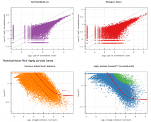 Single-cell RNA-seq analysis supports two different methods for HE analysis. The first uses read data from spike-ins (artificially introduced RNAs of known abundance) to quantify technical noise within the data set and identify HE genes, while the second uses a non-parametric noise-filtering method that does not require the presence of spike-in data. The sample data set used here includes read data from HeLa spike-in transcripts, so in this tutorial we will use the former method. In this tutorial, we will go through the following steps to perform HE analysis on Genestack: 1. Obtaining counts tables from raw reads 2. Testing for heterogeneous expression 3. Using the visualisation application to explore results
 1. Obtaining counts tables from raw reads
The initial processing stages of the HE analysis pipeline are shared with the differential expression pipeline. Specifically, before performing HE analysis using Single-cell RNA-seq analysis, we must go through the same steps used for total RNA-seq on Genestack:- Perform QC and preprocessing of raw reads for each sample
- Map the raw reads from each sample to the A. thaliana genome
- Create count tables with the number of reads mapped to each annotated feature in the reference genome
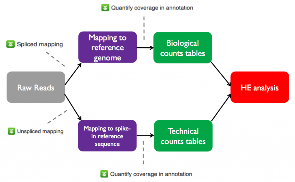 The raw and mapped reads files and counts tables for the sample data set are all available on Genestack in the Tutorials folder. On the next page we will test heterogeneous gene expression.
 2. Testing for heterogeneous expression
We will now use the Single-cell RNA-seq analysis application to identify those genes which show a strong biological variability across the samples. The Analyse application takes as input the folder containing the biological counts tables, and optionally the folder containing the technical counts tables. Technical counts are not required, but if they are provided, there needs to be a technical counts table for each biological counts table.To create a new single-cell RNA-seq analysis file, we first select the folder containing the biological counts tables (Counts tables for A. thaliana), and then the folder containing the technical counts (Counts tables for spike-ins). We then go to Analyse → Single-cell RNA-seq analysis. This will create a new file and put it directly into your 'Created Files' folder.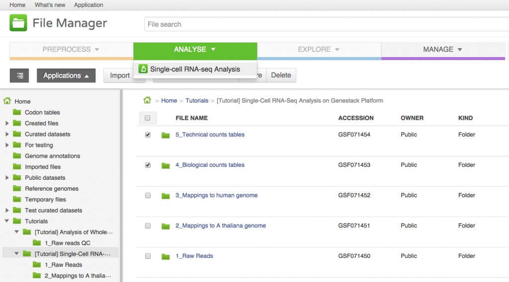
Several options are available for this analysis:
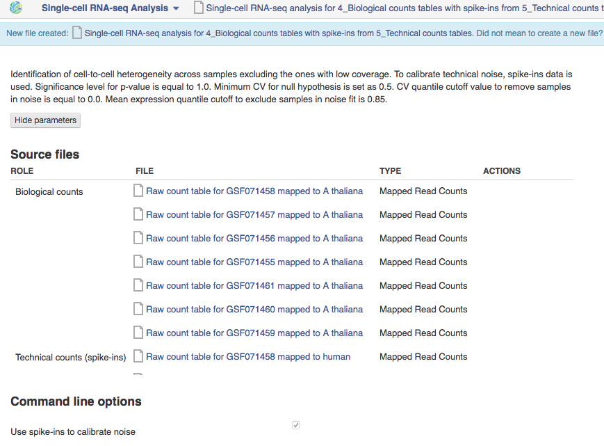
- Use spike-ins to calibrate technical noise: this determines whether or not spike-in data should be taken into account to quantify technical noise. If spike-ins were included in the experiment, it is recommended to use this option. In our case, it is checked by default since we have provided two counts folders to create the HE analysis file.
- Exclude samples with low coverage: this will remove automatically samples with a low mapping rate from the HE analysis. It is often the case in single-cell datasets that samples get contaminated or lost. However, in our case, no sample needs to be excluded from the analysis.
- Significance level for the P-value: here, we will use the default of 1, which corresponds to selecting genes for which P = 0.1
The next parameters are only relevant in the case where spike-in data are provided:
- Expected biological CV: this is the threshold quantifying the level of biological variability expected in the null hypothesis of the model. The default of 0.5 is usually appropriate.
- Noise fit parameters: these two parameters enable us to exclude a fraction of the spike-in genes to fit the noise model. This is usually required for the noise model to be fit properly, because extreme outliers tend to skew the fit. The default values of these parameters are suitable in our case. They should only be changed if the noise model appears to be wrong in the Single-cell RNA-seq visualiser (see next page).
3. Using the visualisation application to explore results
To open the single-cell RNA-seq visualiser, select the Single-cell RNA-seq analysis file and click on Explore → View with single-cell RNA-seq visualiser. When the page has loaded, a dialogue box appears asking whether or not to use the names of the originally-uploaded file names (typically raw reads or aligned reads) as the names of the samples in the visualisation; select "Yes".  The first part of the visualisation is an info-box displaying basic information about the analysis: the name, accession and owner of the file; the total number of samples and the number of samples excluded during the analysis; the names and accessions of any samples excluded; the number of biological and technical features; the significance level of the analysis; and the number of highly-variable genes identified. The red button beneath this info-box displays the ID of every highly-variable gene.
 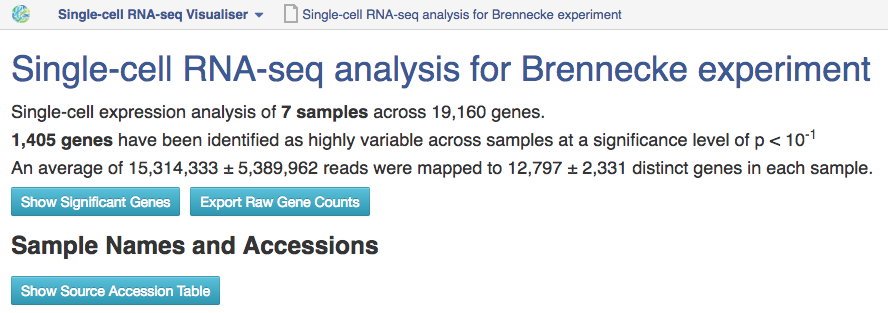 In the next section, labelled Sample Names and Accessions, the blue button displays a table showing the accessions of the relevant counts tables for each sample. Below this, the application allows you to manually rename individual samples for visualisation purposes; click on the info-popover (the small blue question mark) next to the Rename button for more information.Next, the visualisation displays quality-control (QC) plots adapted from figures in the original Brennecke paper. The top two plots allow assessment of the quality of individual samples, while the bottom two allow assessment of the quality of the technical noise fit calculated by Single-cell RNA-seq analysis. In both cases, a detailed description of the plots is given in the accompanying info-popovers.
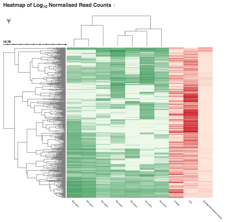
  Having checked that the quality of the samples and fit, we can move on to visualising the results of the analysis. After the QC plots, an interactive heatmap displays the log normalised read count of each of the 400 most significant HE genes in each sample. The rows of the heatmap can be filtered by selecting subtrees within the row dendrogram; the columns can be filtered by clicking on the filter icon in the top-left corner of the heatmap. The rows and columns of the heatmap are ordered according to the hierarchical clustering pattern of the genes and samples, respectively; of particular interest is the column dendrogram, which shows the clustering pattern of the samples based on the correlation in their expression profiles across all HE genes. In this case, the dendrogram appears to divide the samples into two clusters: one of three cells (samples 1, 2 & 5) and one of four (samples 3, 4, 6 & 7).
  Following the heatmap is an interactive principal component analysis (PCA) scatter plot, which provides an alternative method of visualising the clustering pattern of the samples based on their expression of the HE genes. As in the column dendrogram, samples 3, 4, 6 & 7 appear to group together; however, samples 1, 2 & 5 do not appear to form a cluster, being widely separated in the first principal component. This demonstrates the value of including two independent clustering visualisations; by comparing the two, we can gain a better understanding of how the samples in the data set group together.
 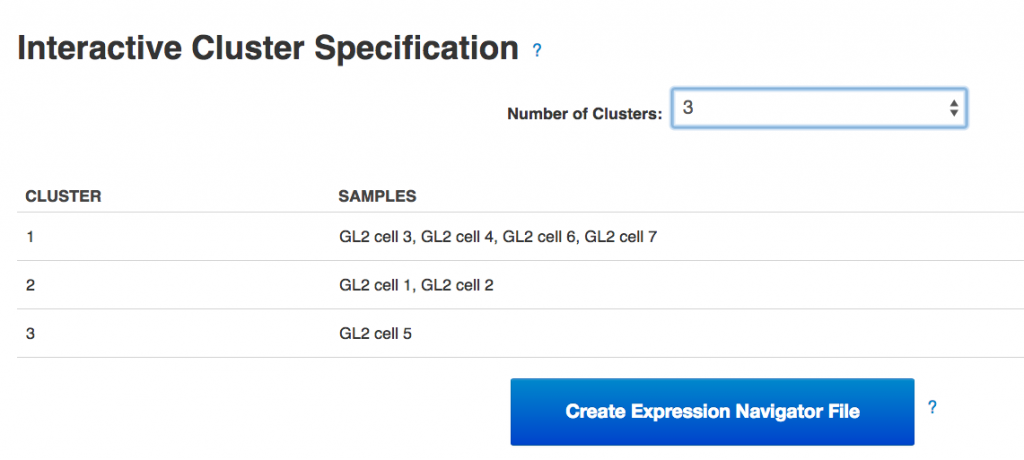 Finally, the section of the visualisation titled "Interactive Cluster Specification" allows the user to specify a number of clusters using a dropdown selector. Once a number of clusters has been selected, the application divides the samples into that many clusters by cutting the heatmap column dendrogram at the highest possible point that produces the desired number of sub-trees. Each sample is assigned a cluster value according to its position in the cut dendrogram, and a table below the dropdown selector displays the clusters produced. In the PCA plot, each point is re-coloured according to the cluster value of the corresponding sample, allowing the results of the two clustering methods to be directly compared. By experimenting with different numbers of clusters, we can determine which number best reflects the diversity we see in the data set.Once the best number of clusters has been determined, the large button marked "Create Expression Navigator File" can be selected to perform differential expression analysis on the clusters identified, in order to investigate any underlying biological differences between the clusters.Genestack single-cell RNA-seq analysis apps can be immediately used for free with public datasets or your own data, just sign in and enjoy!!